Histograms visually summarize the distribution of a continuous numeric variable by measuring the frequency at which certain values appear in the dataset. The x-axis in a histogram is a number line that has been split into number ranges, or bins. For each bin, a bar is drawn where the width of the bar represents the range of the bin, and the height of the bar represents the number of data points that fall into that range. Understanding the distribution of your data is an important step in the data exploration process.
Example
The histogram below visualizes distribution of voter turnout in the 2016 United States election.
- Number—Voter turnout
- Overlays—Mean, normal distribution

Data
The Data configurations include the variable that is used to create a histogram, the number of bins, and the statistics that are displayed on the chart.
Variable
Histograms require one continuous Number variable on the x-axis.
Some analytical methods require that data be normally distributed. When the data is skewed (the distribution is lopsided), you can transform the data to make it normal. You can apply transformations to the chart using the With transformation parameter. Transformations can be either logarithmic or square root.
Tip:
For reference, you can add a normal distribution overlay to a histogram by selecting Normal distribution under Overlays.
Logarithmic transformation
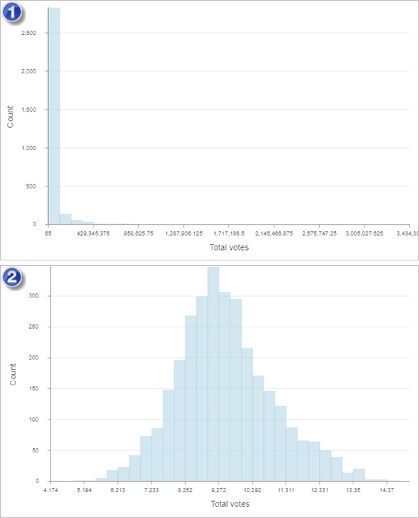
The logarithmic transformation is often used when the data has a positively skewed distribution and there are a few large values. If these large values are located in your dataset, you can use the log transformation to make the variances more constant and normalize the data.
The examples below show the distribution of total votes in the 2016 United States election. The first image is positively skewed and has no transformation applied. The second image has a logarithmic transformation applied, which gives the histogram a more normal distribution.

| Image | Transformation |
|---|---|
 | None |
 | Logarithmic |
Note:
Logarithmic transformations can only be applied to numbers greater than zero.
Square root transformation
A square root transformation is similar to a logarithmic transformation in that it reduces right skewness of a dataset. Unlike logarithmic transformations, square root transformations can be applied to zero.
Note:
Square root transformations can only be applied to numbers greater than or equal to zero.
Bins
The default number of bins is 32. You can adjust this by changing the Bins value on the Data tab. Changing the number of bins allows you to see more or less detail in the structure of your data.
You can change the color of a histogram's bins using the color patch next to Bin color.
Overlays
The following descriptive statistics are calculated and displayed as lines on histograms:
- Normal distribution—A bell-shaped curve used to compare data to a normal distribution
- Mean—A single vertical line indicating the mean value of the dataset
- Median—A single vertical line indicating the median value of the dataset
- Standard deviation—Two vertical lines indicating the values of one standard deviation above and below the mean
Click the overlay to turn it on or off. You can change the color of the line using the color patch next to the statistic.
You can turn on labels using the Show data labels parameter. The labels indicate the count of values for each bin.
Statistics
The following statistics are listed for the selected numeric field:
- Mean
- Medium
- Standard deviation
- Rows
- Count
- Minimum
- Maximum
- Sum
- Nulls
Axes
The Axes configurations are used to change the specifications for the x-axis and y-axis.
You can format the way the x- and y-axis display numeric values by specifying the number of decimal places and whether to include a thousands separator.
Default y-axis bounds are based on the range of data values represented on the y-axis. You can customize these values by typing a Maximum bounds value. Set a y-axis bound to keep the scale of the chart consistent for comparison. Click the Reset button to revert the axis bound to the default value.
Guides
Guide lines or ranges can be added to charts as a reference or way to highlight significant values. Guides are added to the y-axis by clicking the Add guide button.
To create a guide line, enter a Start value where you want the line to draw. To create a guide range, enter a Start value and an End value. You can also change the appearance of the guide line or range. For lines, the style, width, and color can be updated. For ranges, the fill color can be updated.
You can optionally change the name of the guide using the Guide name parameter and add text to your guide using the Guide label parameter (for example, Median).
You can choose whether the guide renders on top of the chart or under the chart using the Above and Below buttons in the Render parameter.
Format
You can configure the look of the chart by formatting text and symbol elements. Chart formatting options include the following:
- Text elements—Size, color, and style of the font used for the chart title, x-axis title, y-axis title, legend title, description text, legend text, axis labels, and data labels. You can change the format for multiple elements at once by pressing Ctrl and clicking to select the elements.
- Symbol elements—Color, width, and style (Solid, Dot, or Dash) for grid and axis lines and the background color of the chart.
General
The default titles for charts and axes are based on the variable names and chart type. You can edit or turn off the titles on the General tab. You can also provide a title in the Legend title parameter and a chart description in the Description parameter. A description is a block of text that appears at the bottom of the chart window.
Resources
Use the following resources to learn more about charts:
- Configure charts
- Configure pop-ups to add charts